This website is not current and will be retired at some point. See About for latest.
A tool for visualizing network relationships and exploring patterns of connection. Try the interactive demo.
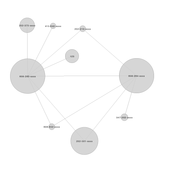
Visualizations of simple graph data convey nothing about the quality of the relationships between network nodes; only the binary states (connected/not connected) are communicated.
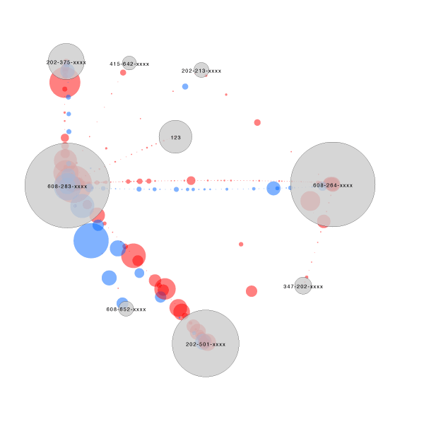
This tool adds three new dimensions of data: the frequency, directionality, and duration of connections. In this example, telephone call records serve as the data source, so each colored circle represents a phone call between two numbers. Larger circles are longer phone calls, and color indicates directionality (who called whom).
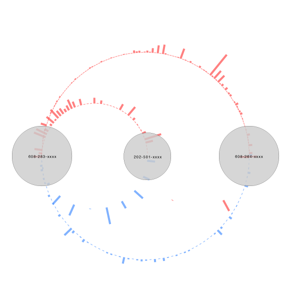
Other shapes can be used to represent each instance of connection. Rectangles are used to generate a bar chart-style representation, where longer calls are taller bars. Meaningful patterns can now be perceived and explored (e.g. A calls B more often, but when B calls A, they talk for longer periods of time).
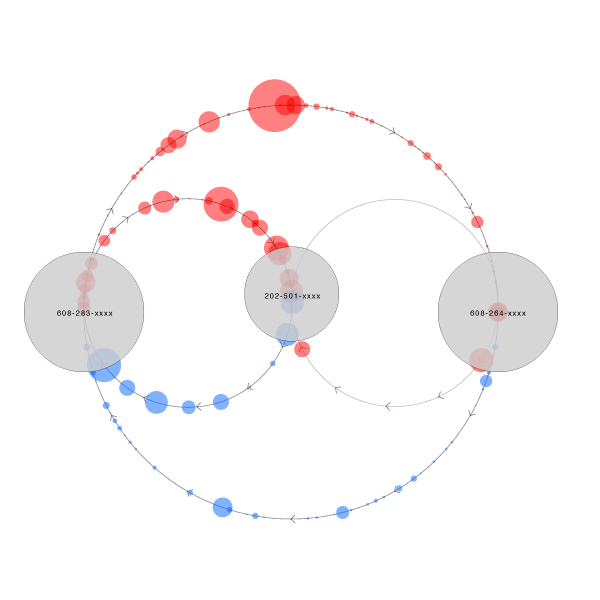
Arrows are overlaid, so directionality can be understood even without motion.