This website is not current and will be retired at some point. See About for latest.
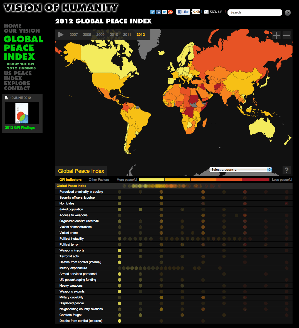
Together with the Institute for Economics and Peace and Rosten Woo, I co-designed and developed this interactive data map to communicate the results of the 2012 Global Peace Index, an annual measurement of levels of 158 countries’ peacefulness.
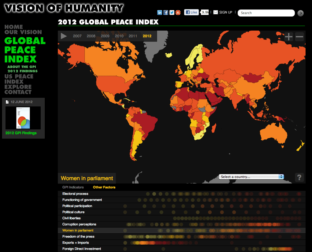
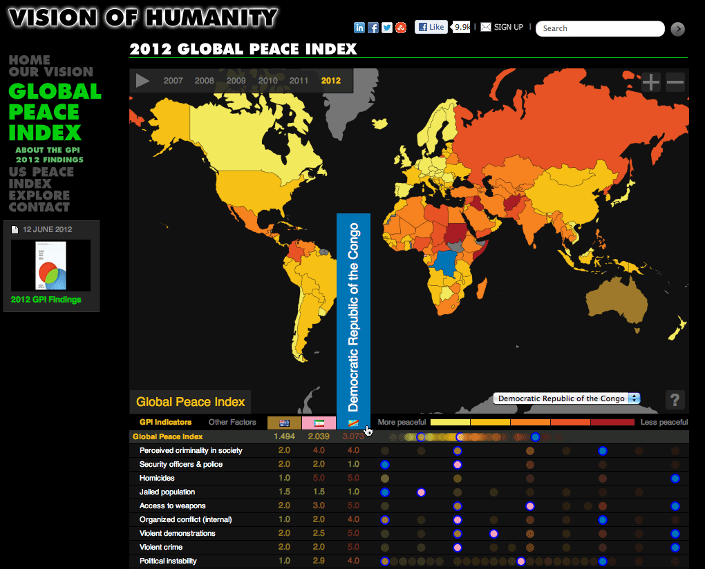
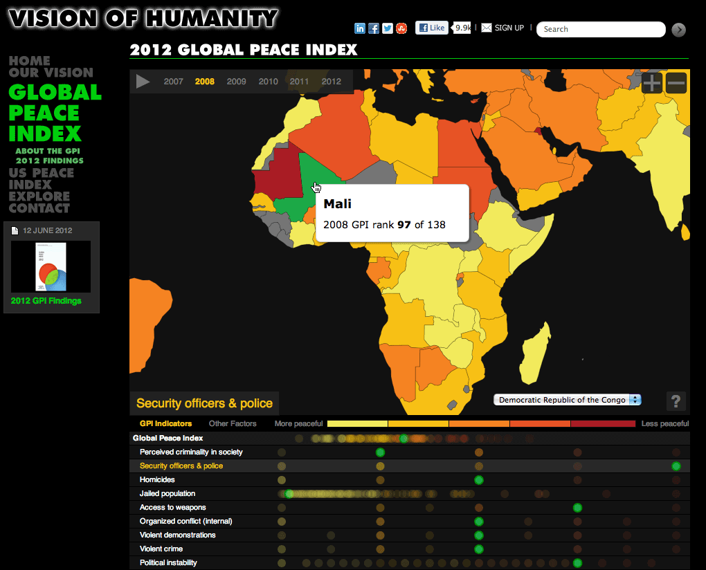
The map displays six years’ worth of historical data, not just for the overall Peace Index score, but also for the 23 component peace indicators and 31 additional factors. The timeline allows play-through of the historical data, while circles peacefulness scores make distributions clear at a glance. By comparing countries and moving through time, it is possible to see how certain countries and regions have increased or decreased in peacefulness since 2007.
By hovering over the map, countries and associated circle values highlight (and vice versa), enabling quick, relative comparisons of the data (e.g., “How well is Mozambique doing, relative to other nations?”) and identifying which countries share similar scores.
Developed using D3, the piece works on all current browsers that support SVG (Chrome, Firefox, Safari, and IE9), including Mobile WebKit.
The project was viewed over 150,000 times on the day of launch. It was featured in both The Economist and The Guardian.